
The Share Centre Website

The Share Centre is an independent UK retail stockbroker where customers can purchase shares and other financial products such as ready made ISA's.
The client engaged Rufus Leonard to redesign their existing brochure and account management website with a focus on making the site mobile responsive. Displayed here is the brochure section of the website, built using the CMS EPiServer. We are set to begin the account management section soon.
My roles
- Lead UX architect on the project
- Overseeing a junior member of the UX team
- Running client co-creation UX workshops
- Responsible for delivery of detailed functional specification documents for off-site development team
- Publishing reports from Google Analytics to inform current user behaviour
- Designing remote quantitative user testing
- Working closely with the client side business analyst to design for all third party services
- Working collaboratively with the client on cloud based Axure 8
- Working with the client to assess further investment in components and templates
- Briefing & collaborating with design
Homepage
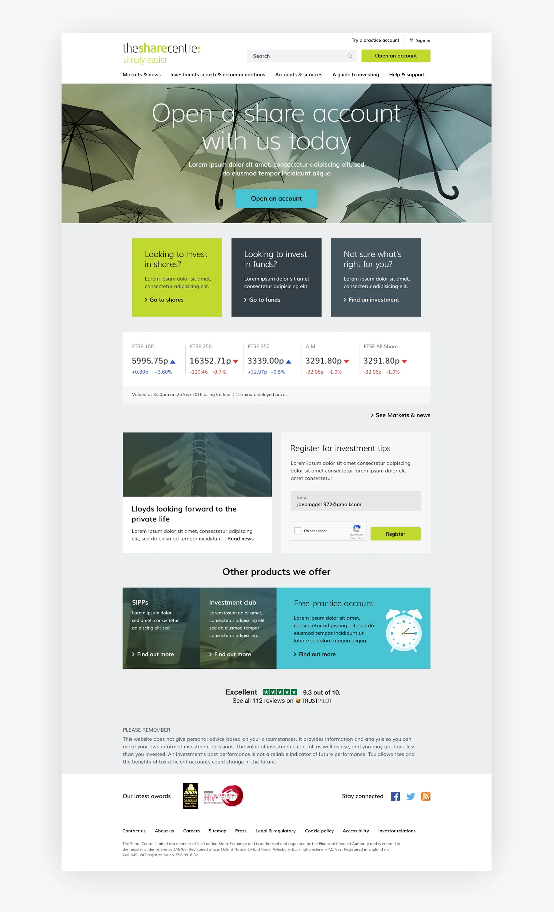
Homepage
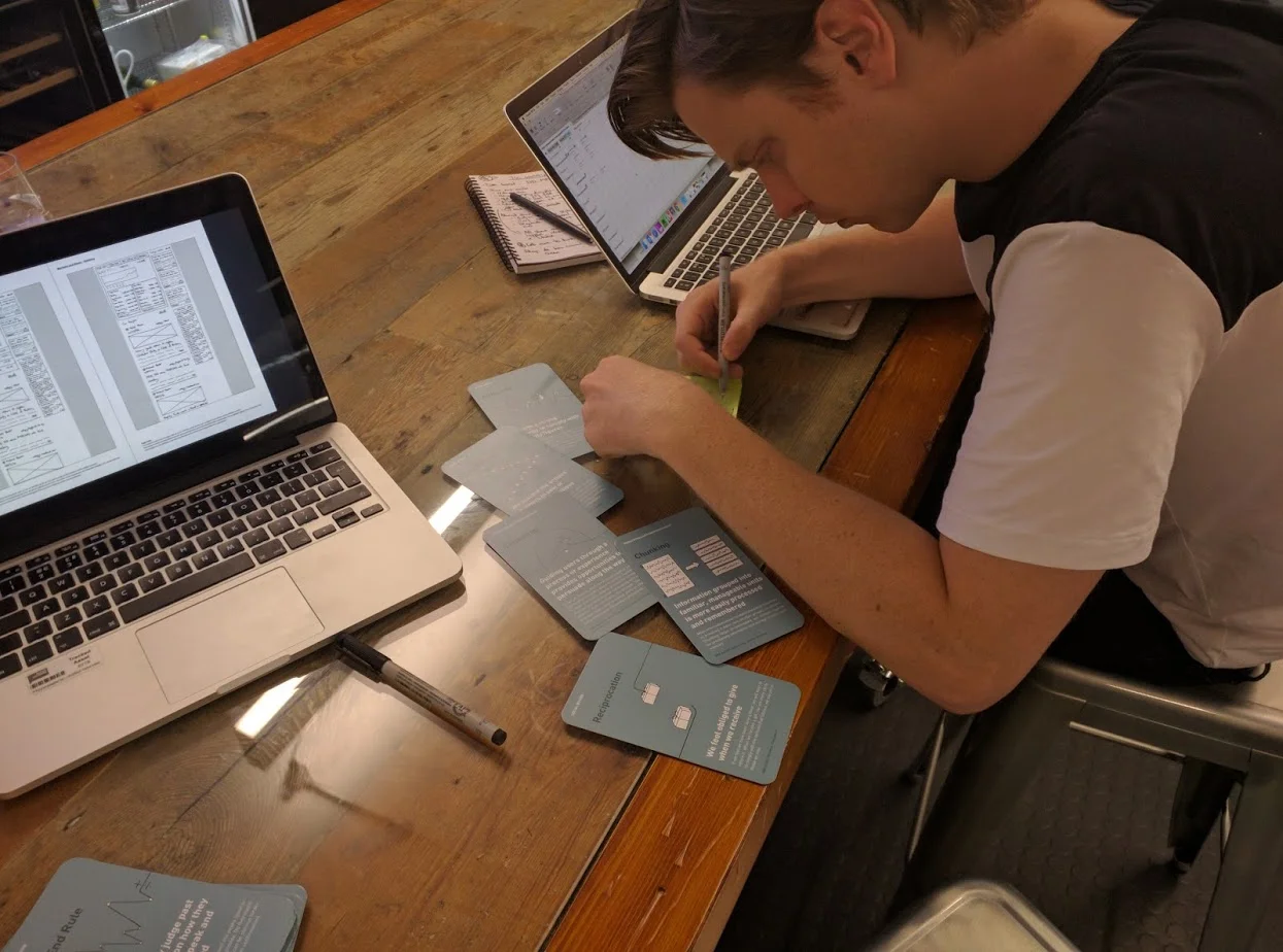
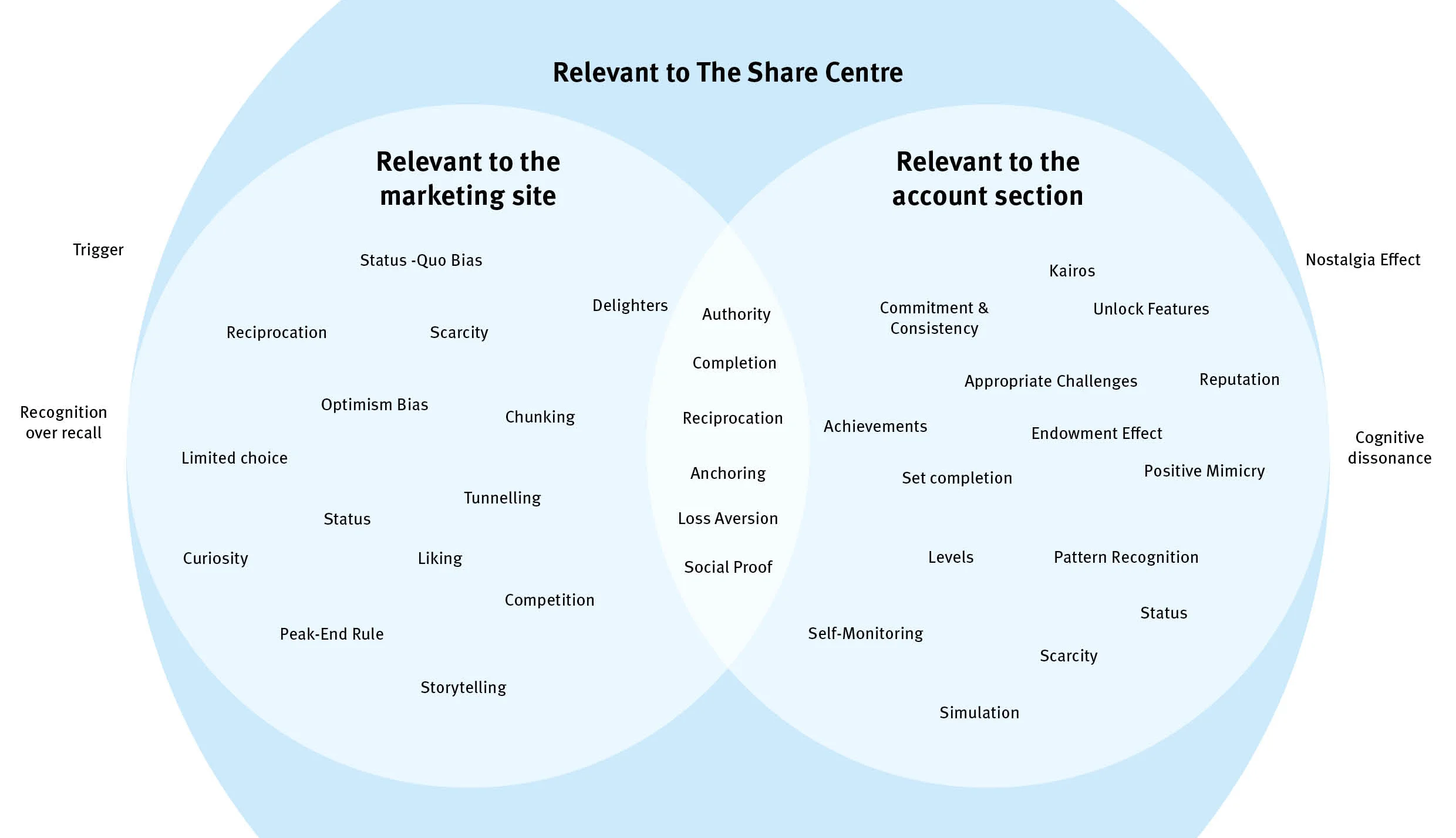
Behavioural Economics Workshop
As part of the design process I recommended and held a behavioural economics workshop where we used common cognitive biases to influence the communications of the brochure section of share.com. Our KPIs for the project were accounts sold, shares traded and engagement with news content.
This workshop proved very fruitful, the results of which were presented to the head of customer experience at the share centre.
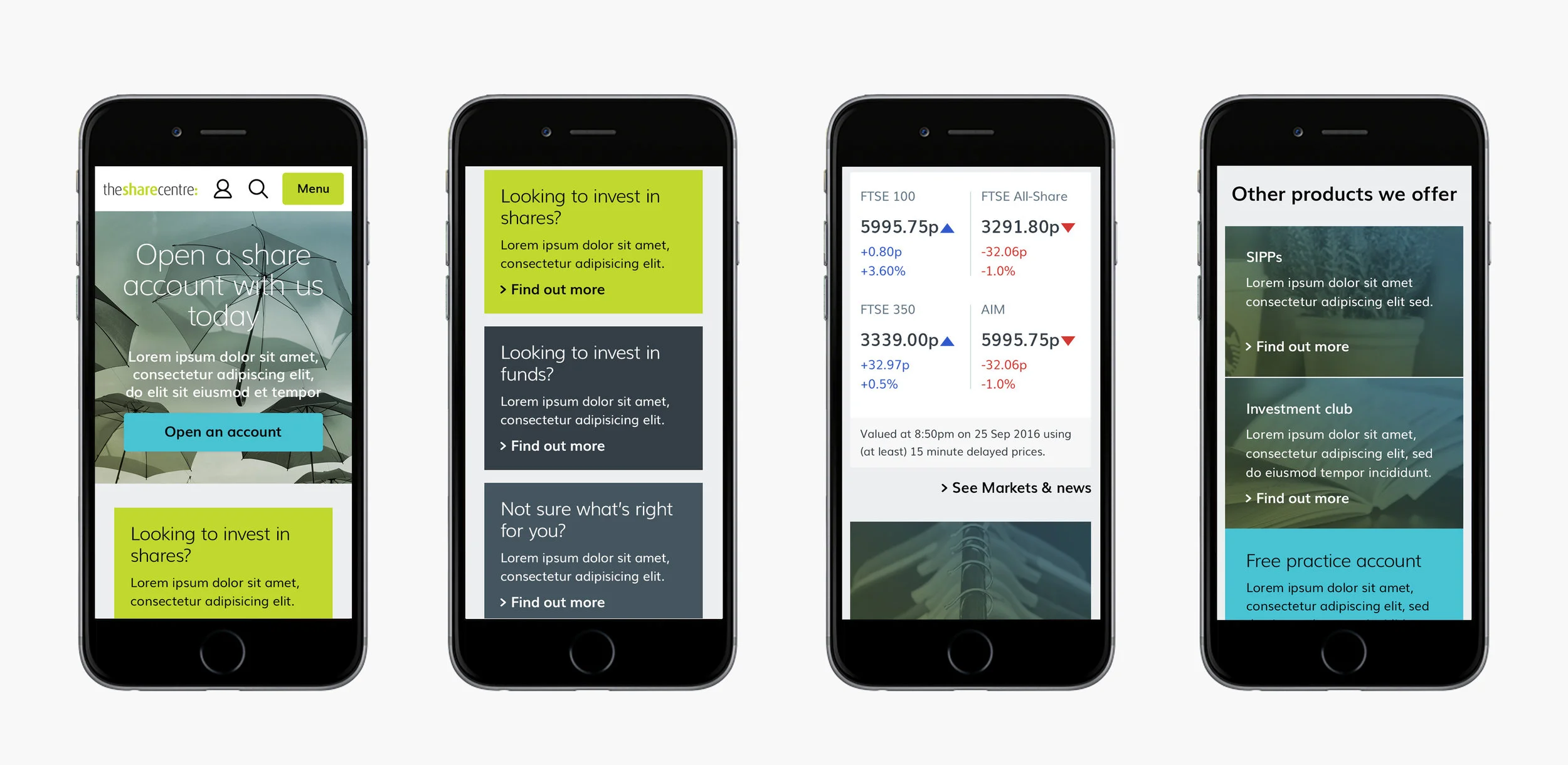
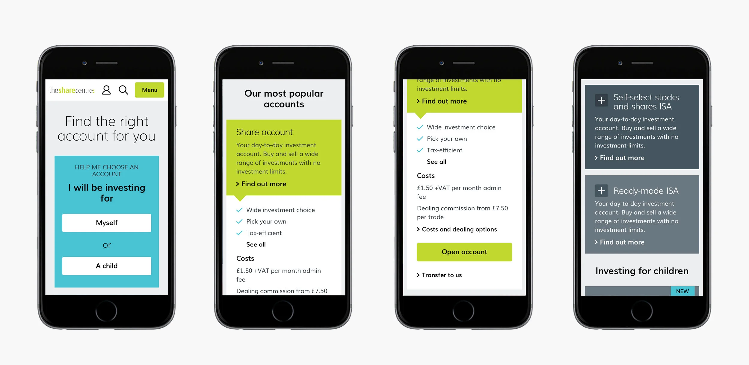
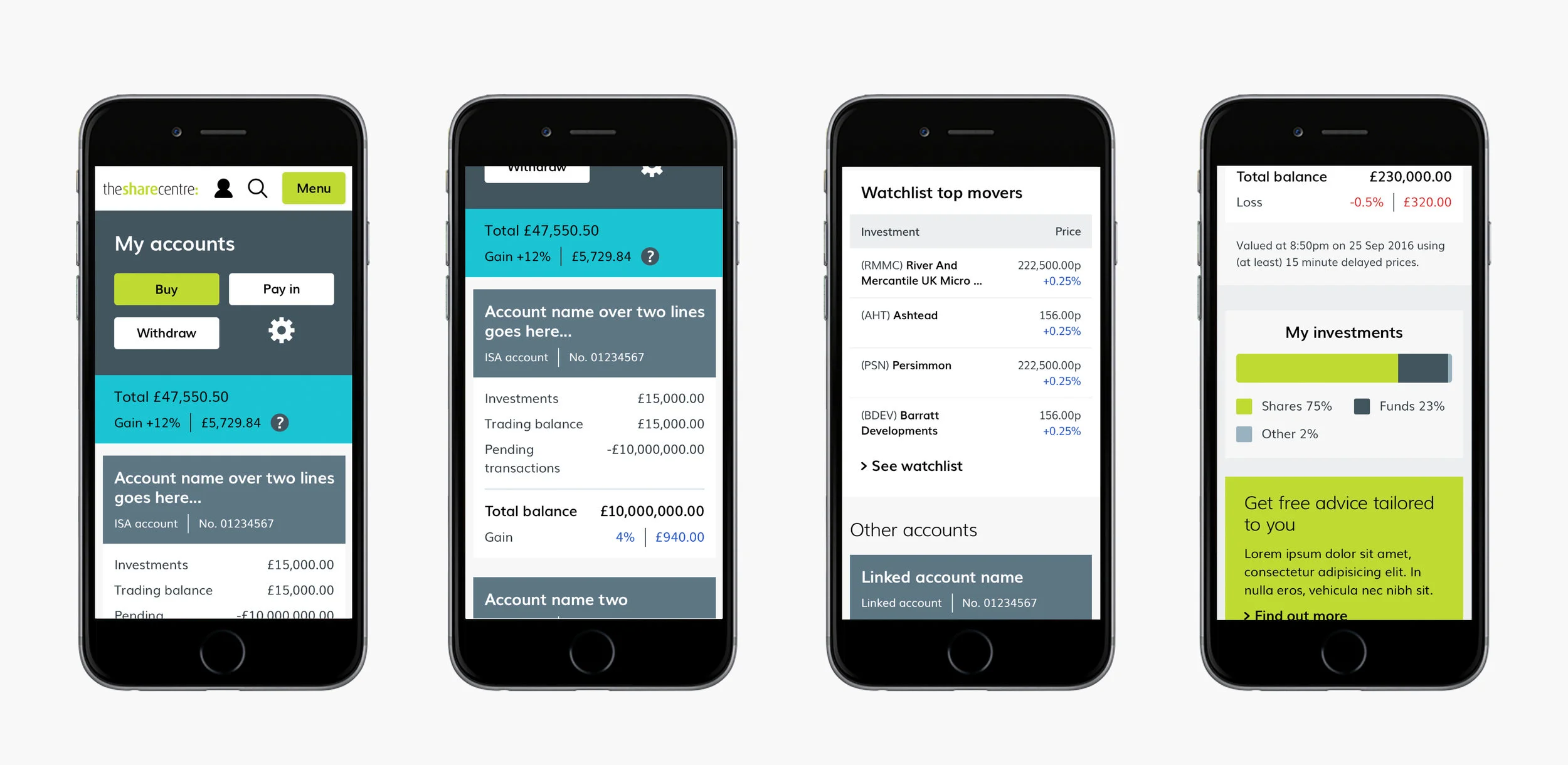
Navigation redesign - Mobile
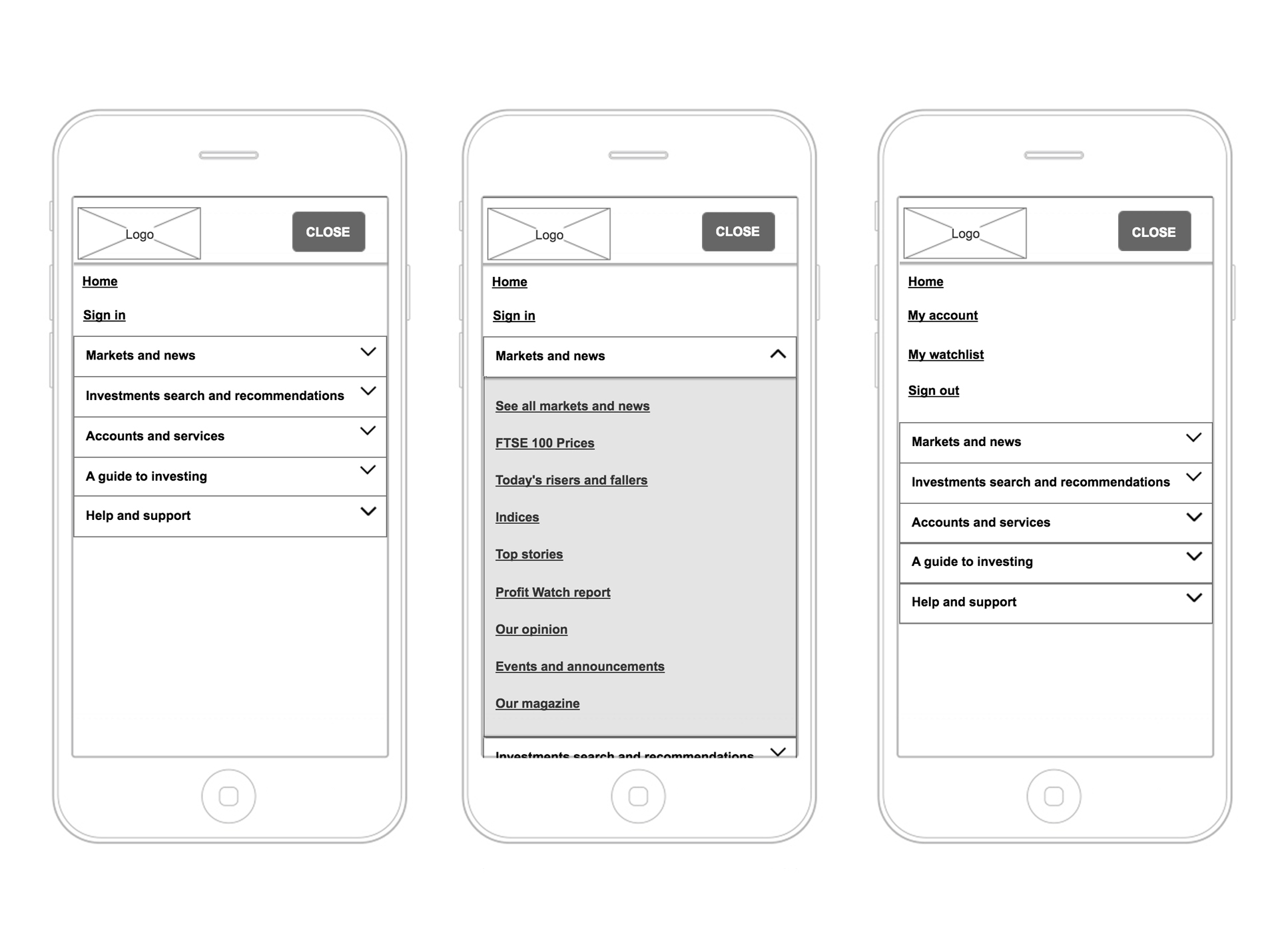
The design of the mobile navigation was such that it only used two levels in order to disclose all links. We also designed the signed in scenario.
Navigation redesign - Desktop

A KPI for the project was driving engagement with the news content. As part of a strategy to achieve this we included some rich content in the navigation under Markets and News. This content was automatically updated regularly.
Original navigation Treejack test results

Optimised navigation Treejack test results
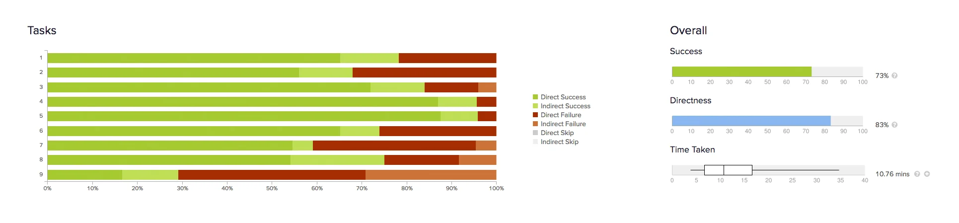
We had enough budget to test the current navigation versus three iterations. Our concepts were based on the findings from Google Analytics of what was or was not performing well in the existing navigation. The results were:
- "Find investments" became "Investment search and recommendations" to better communicate the offering.
- The term "Help" is changed to "Help and advice" to give context that it is help for users on the website as opposed to help with investing.
- "New to Investing" and "Experienced Investors" are grouped together under "A guide to investing" to encompass all education.
- "Markets and news" performs well and due to the KPI of improving frequency, is placed at the beginning
- The removal of "&" increased the success rates in general
Markets and news

Markets and news

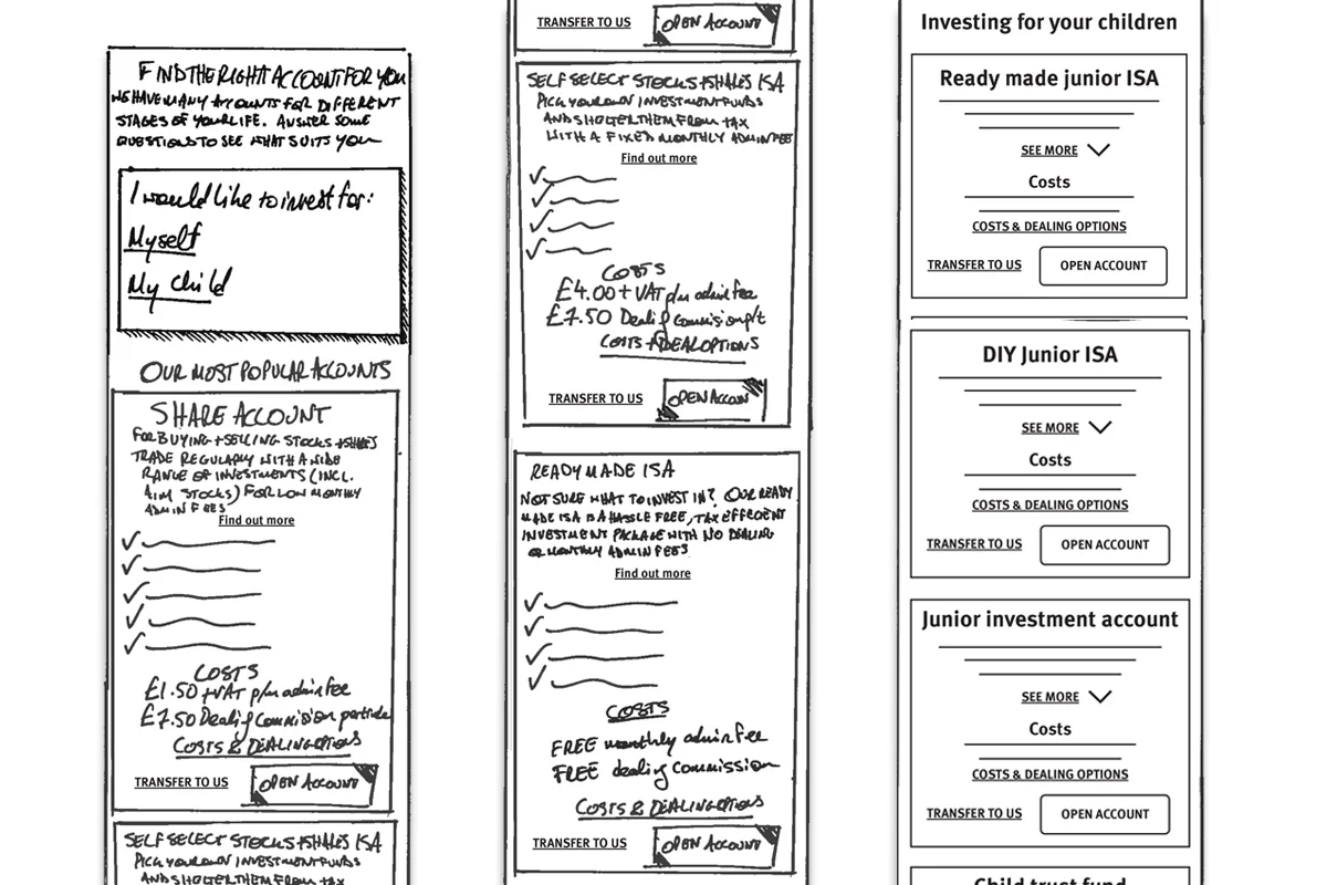
Find a product sketch

Find a product sketch
Account picker

Account comparison
The method of comparing accounts was done through a convoluted table. We changed the hierarchy of the information, making it much easier to identify the correct financial product the customer may have been considering.
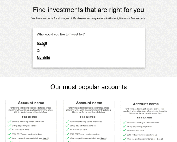
Find a product
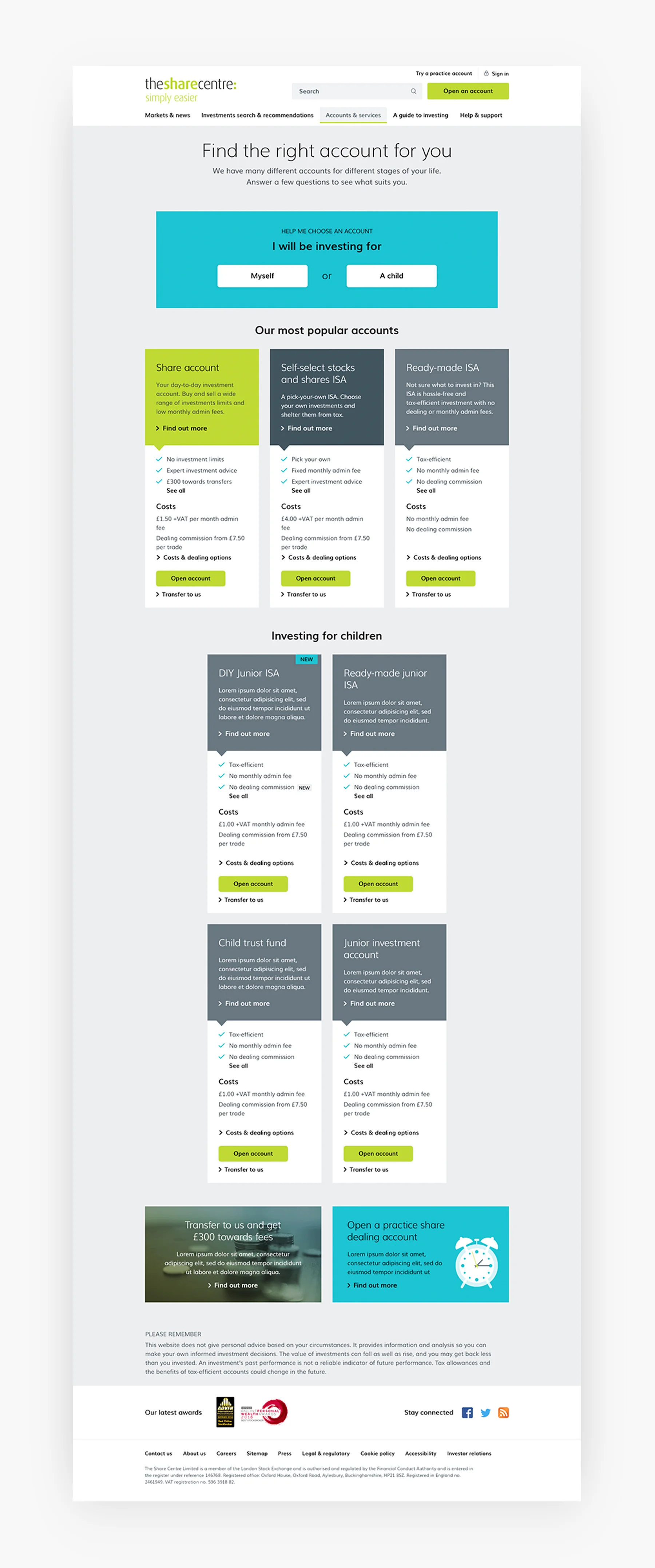
Find a product
ISA Calculator

As calculation tools on competitor websites were intrinsic to the purchasing journey, it became evident that solution outlined by the brief was not going to provide engagement for customers. I worked with the client in order to prioritise components, such as this one, over other components that we knew did not have merit, like a carousel component. The result is a list of components ready for development
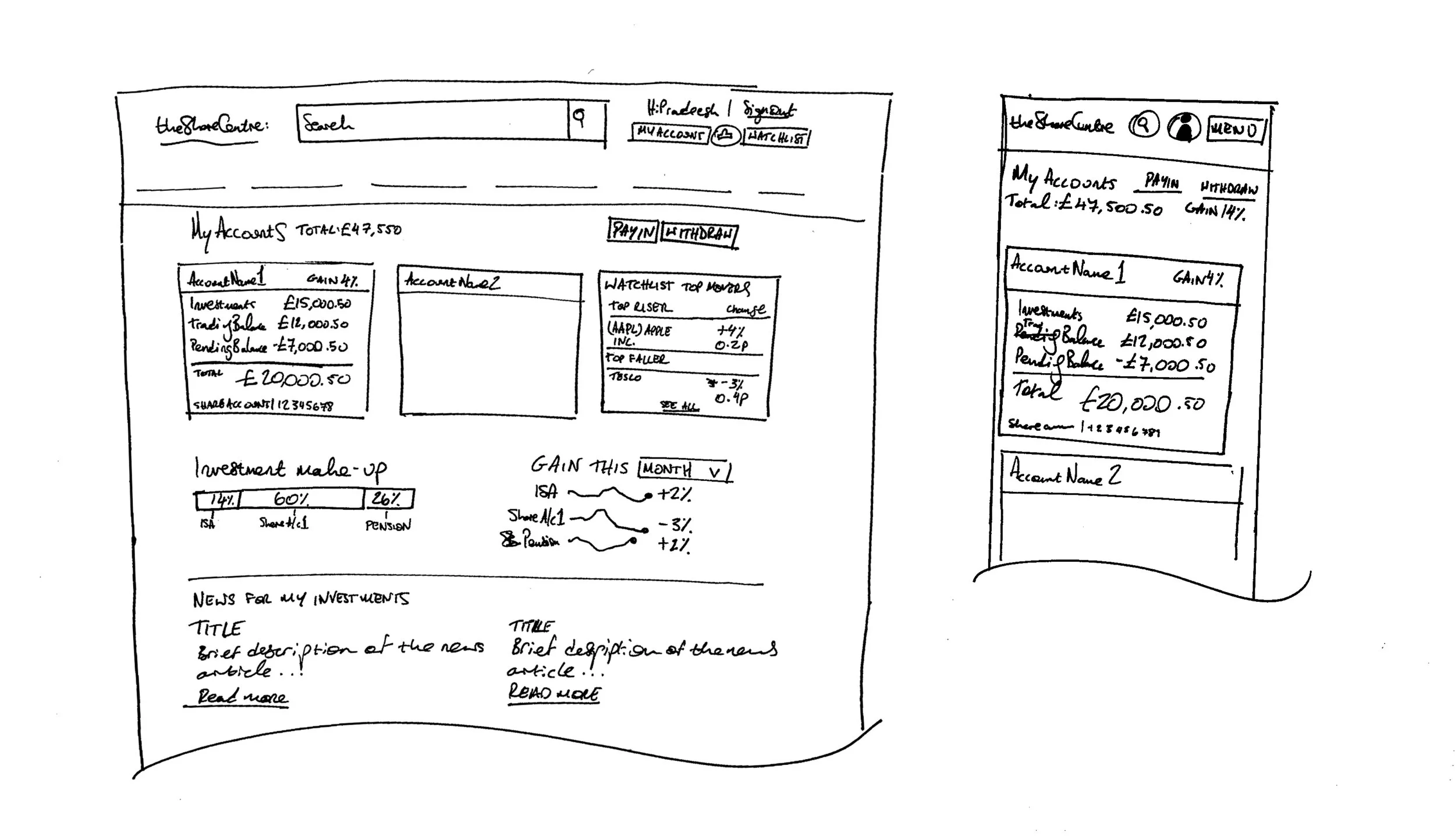
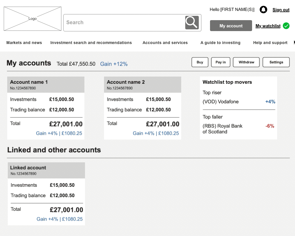
My Account Sketch
My Account Interaction Design
My Account Interaction Design

My Account
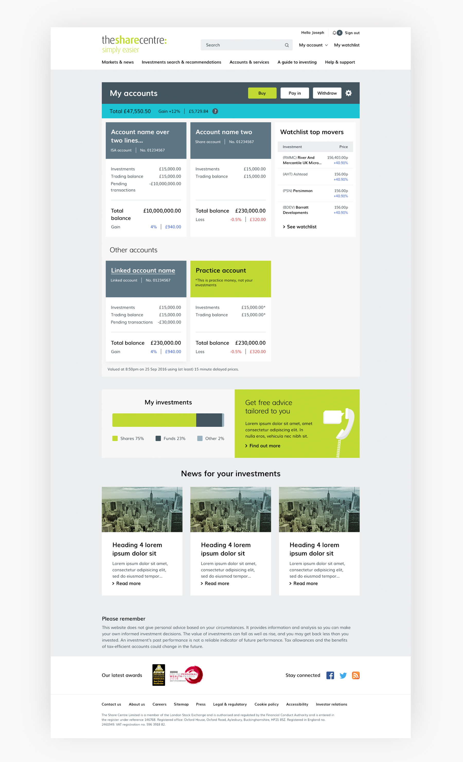
My Account
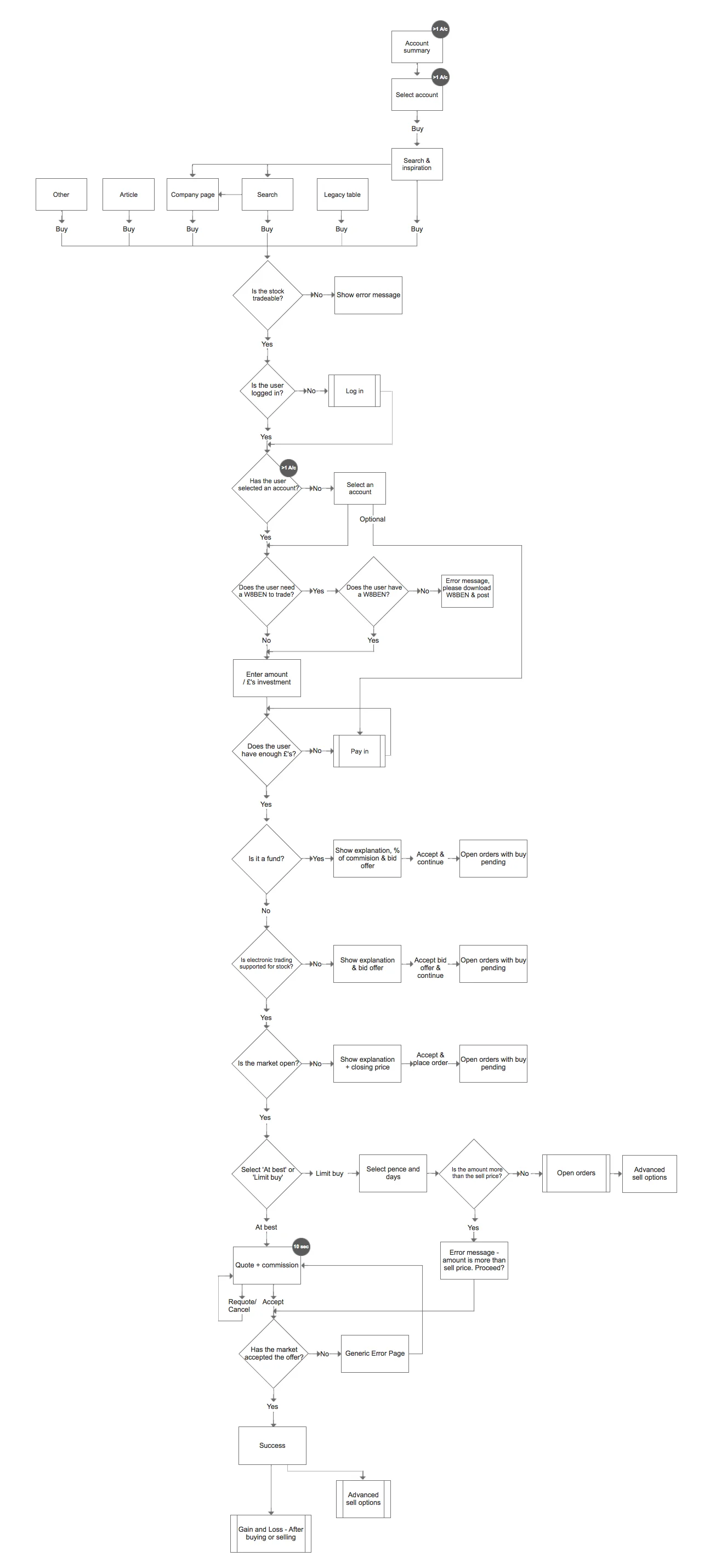
Buy Shares Customer Journey
Limit buy wireframes
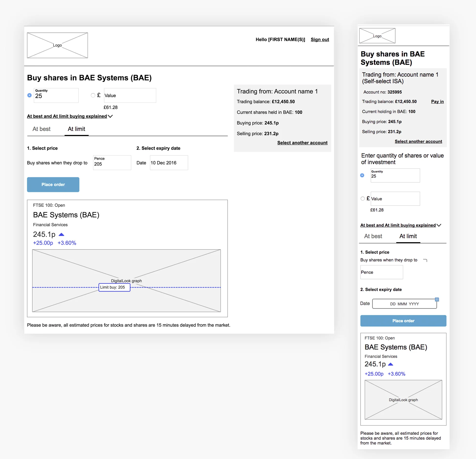
Share traders can set in place a 'limit buy' to purchase shares when they drop to a certain price and set an expiry date for this transaction.