
The AA App

With a significant amount of breakdowns throughout the UK currently reported through The AA app, and this product sitting in the top ten of travel apps in the UK, this is a vital service touchpoint for The AA.
I worked as the lead UX architect on the redesign of the AA app for both iOS and Android.
I joined this project from concept for the pitch which enabled the new strategy, to user testing prototypes new concepts, to overseeing the development. This meant that I could ensure a high quality digital product would be released.
My roles
- Lead UX architect on the project
- Creating a pitch winning UX strategy (informed by analytics and KPIs)
- Hosting workshops with the client
- Building prototypes for user testing
- Design for release on iOS and Android
- Overseeing junior members of the UX team
- Briefing & collaborating with design, development and copywriting
- Developing interaction animation principles for the app
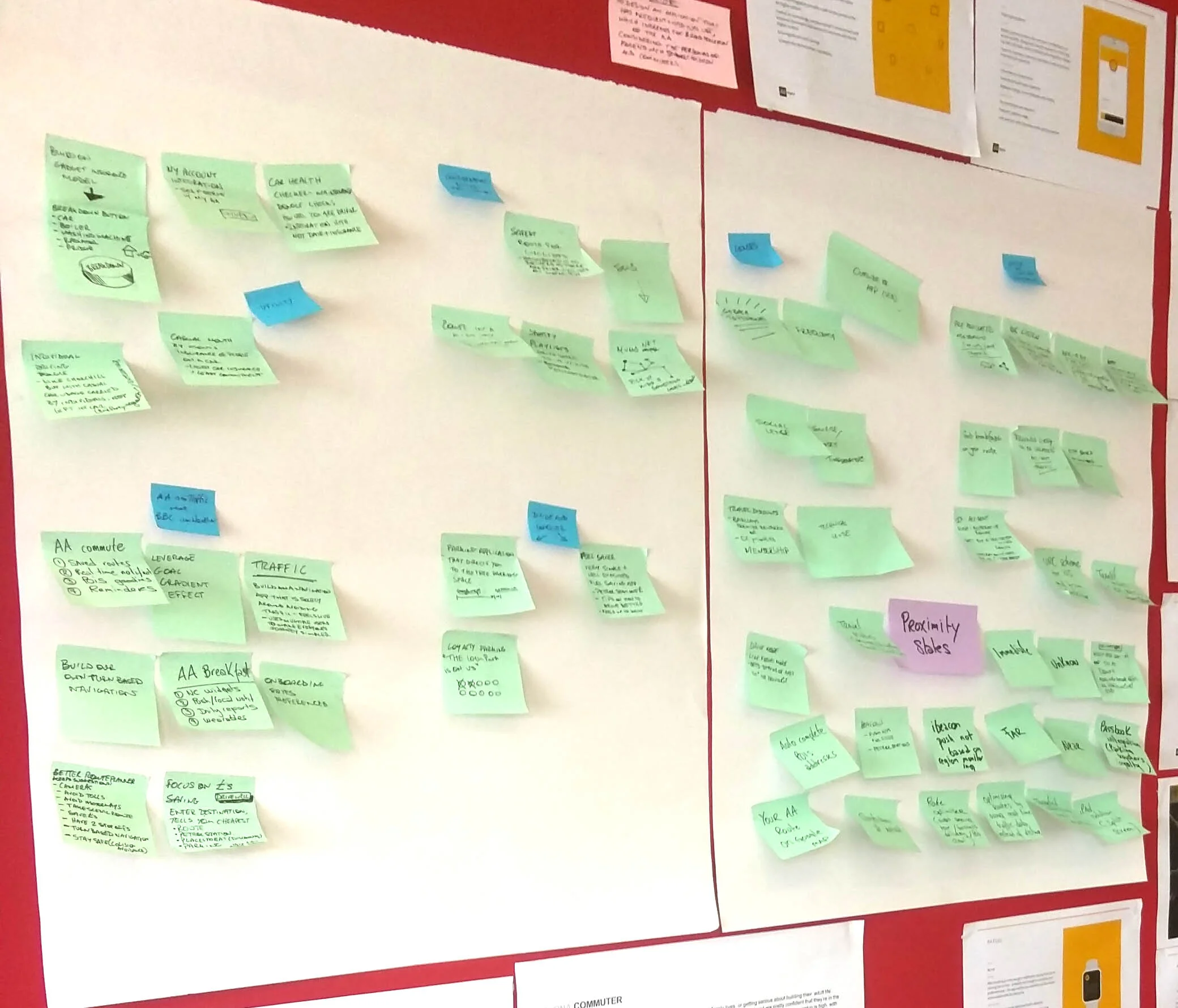
Pitch ideation workshop
I worked with the head of development and the head of UX in order to create a pitch winning concept for The AA. We worked with the client throughout the process and checked in with him in order to ensure that we were pursuing the brief of increasing the frequency of use.
Concepts were created in the following areas;
- Traffic features
- Fuel
- Car maintenance
- Parking
- AA Membership
Methodology
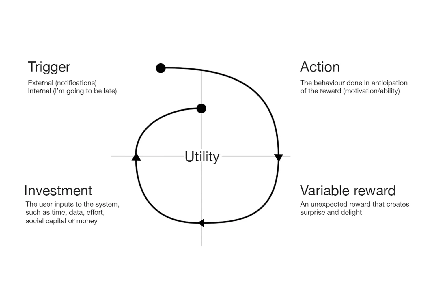
As the brief called for an increase in the frequency of use, we used the Hook model developed by Nir Eyal in order to achieve this. This is a framework for understanding successful social networks and apps. We used this framework to select and develop ideas created from the ideation workshop.
Focus group testing concepts
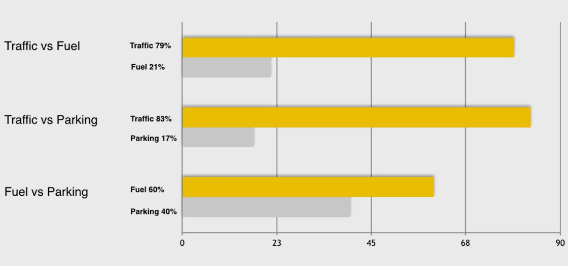
We then took our existing concepts and tested explanations with focus group of 200 commuters. Our concept for traffic features far surpassed any of the features for fuel or parking.
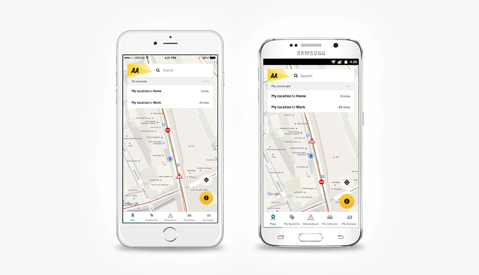
The result was a concept for an app that would notify the user of traffic on a saved route, such as home or work, sending the user updated routes once there were any traffic incidents.
Concept design
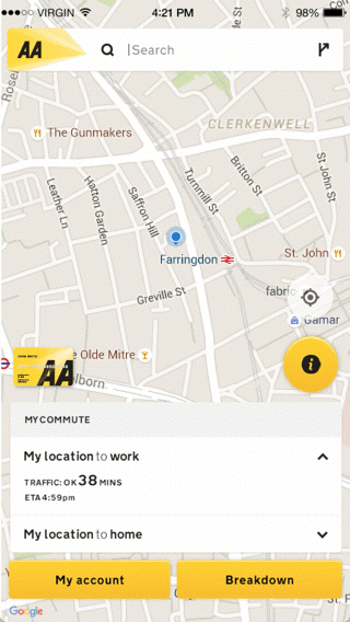
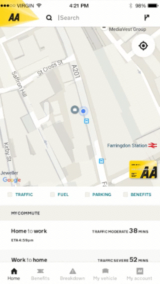
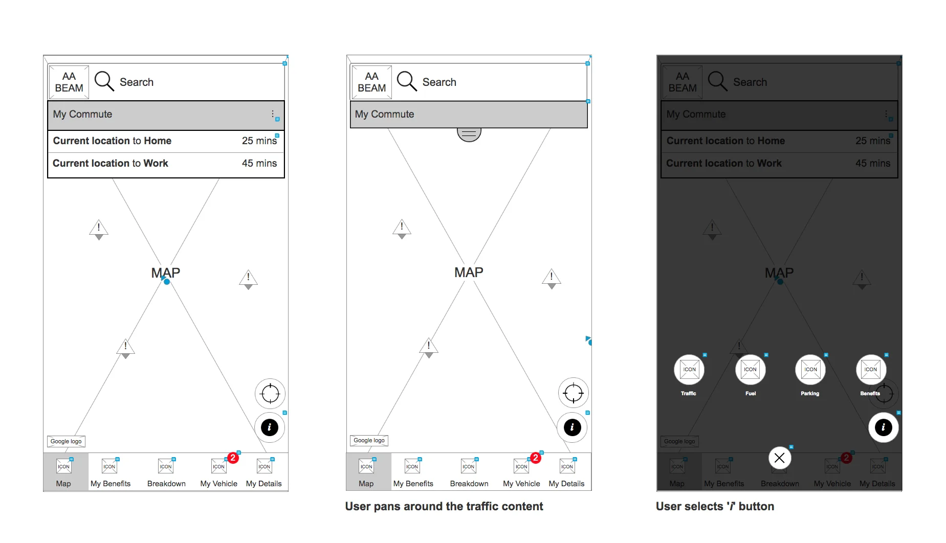
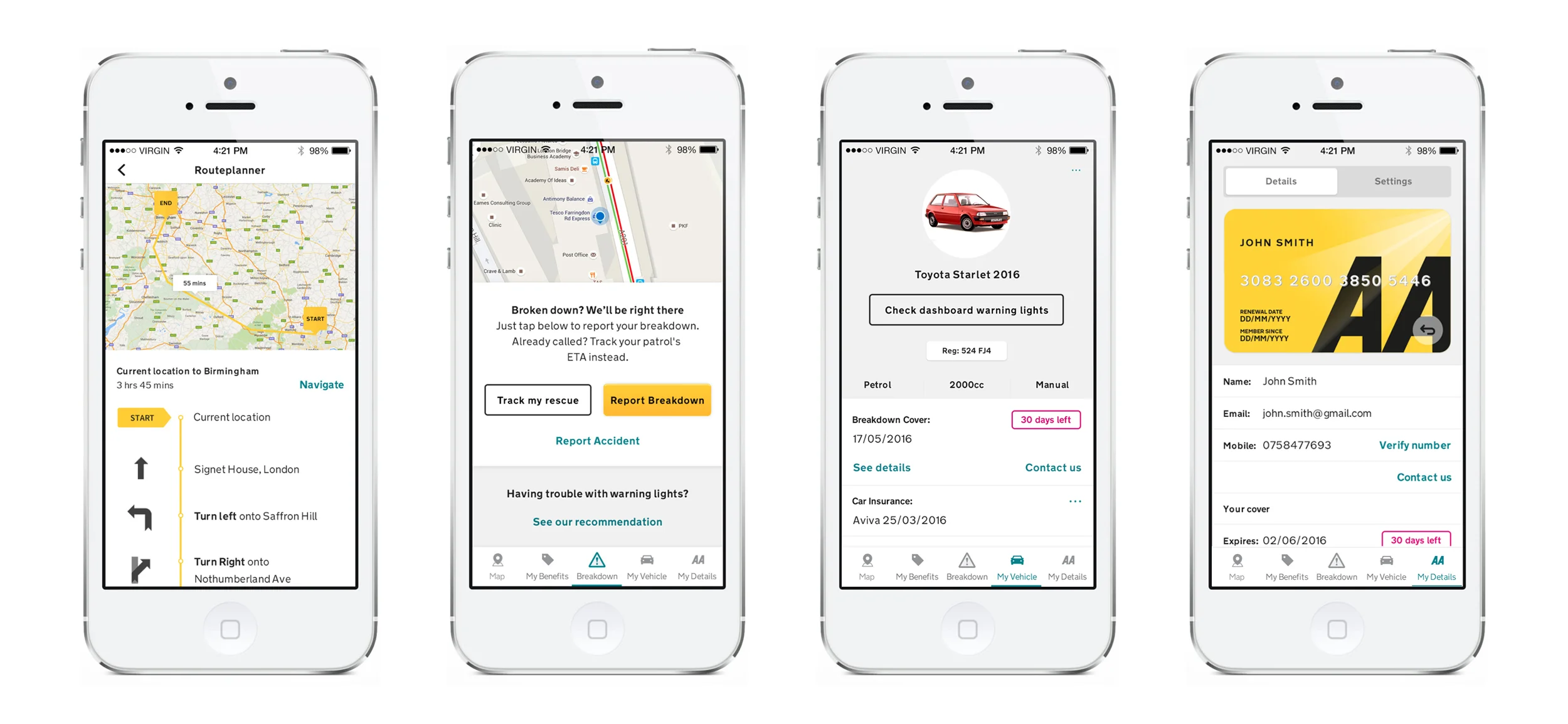
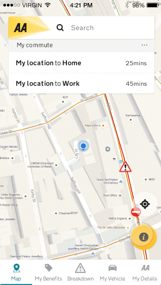
Part of the brief for the redesign of the app was to attempt to drive frequency of use. As a result we focused on the what are currently the more frequently used functions of the app while still trying to drive the discoverability of the less used features. These lesser frequent uses were very important to the business, such as the automated breakdown call out feature. As a result we made the mapping elements the landing screen for the app and developed our concept around that functionality, with other elements being accessible from there.
Concept testing
In order to test these concepts I created high fidelity prototypes for user testing. I worked with the client and the researcher on the project to define the objectives that would identify the winning concept.
User journeys
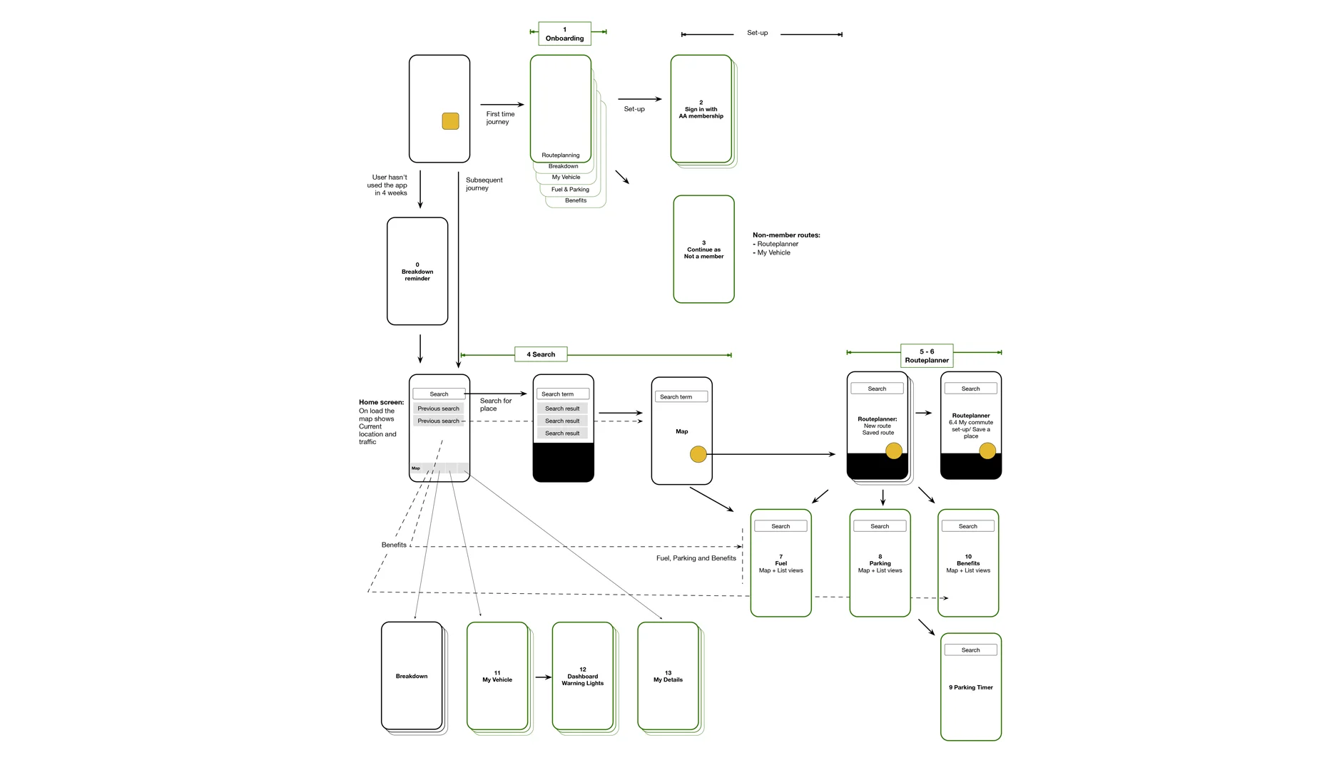
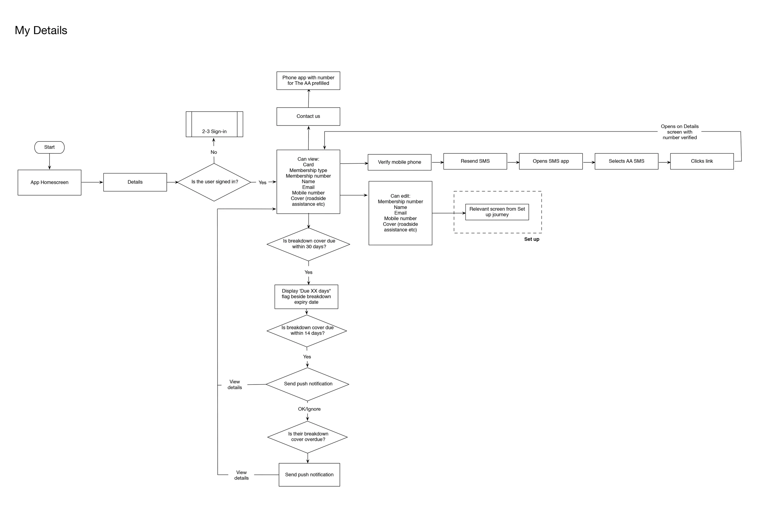
Detailed user journeys were captured near the beginning of the project in order to ensure a cohesive design process and inform the design sprints.
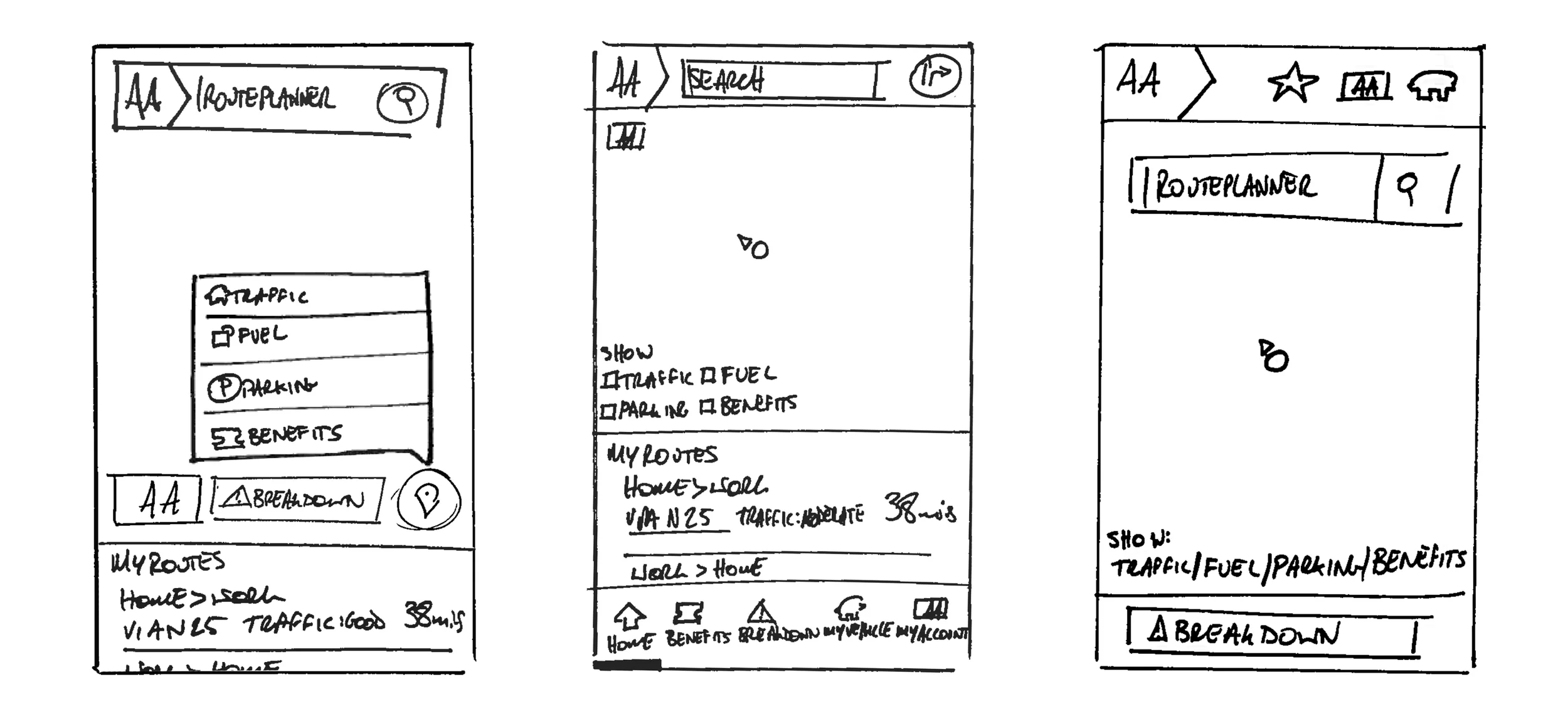
Wireframes and specification
I worked with the project management team to break up journeys, templates and components and develop these as part of an agile method. I specified the majority of the templates and components or oversaw the specification by junior members of the team.
Prototyping and animation
A significant feature of the selected concept was the use of a Material design floating action button. As it was necessary to communicate how the concept worked in the prototype while user testing, this warranted using a prototyping tool that could communicate the animations, so I chose Principle for mac.
This tool helped me consider the transition between screens and to create an experience that provided users with context to the interface as the user moved through the journeys.
