
Vodafone V-Auto App
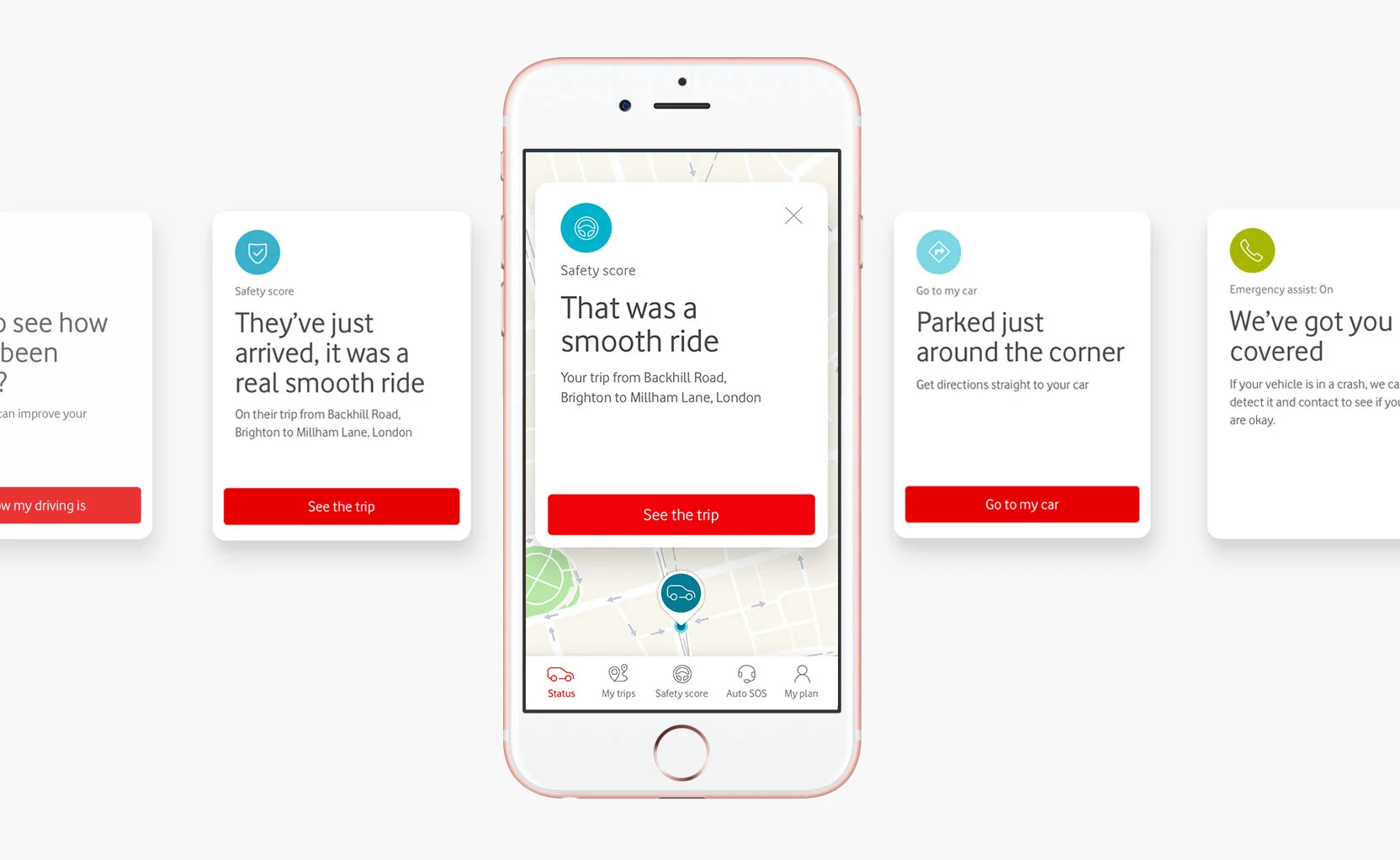
V-Auto is a telematics app launched by Vodafone. The V-Auto SIM enabled telematics device is installed in a customer’s car and, once set-up the device then sends near realtime information to the V-Auto app. The in-car device offers a range of features to the customer, including current car location, automated contact of emergency services in the event of a crash, insurance discounts based on driving behaviour and in car WiFi.
This project broke new ground for Vodafone, enabling one of the worlds leading telecoms companies to establish themselves as a provider of Internet to Things devices and experiences.
My roles
Lead UX on the project
Defining interactions that would become standards for subsequent Vodafone IoT products
Lead the user research designing and running user testing, done per sprint
Concept creation and development
Running co-creation workshops with the client (Typically included Vodafone’s Head of Brand)
Designed experiences for release on both iOS and Android
Creating high fidelity prototypes
Designing user interface’s in adherence with the Vodafone design system
Driver safety score concepts
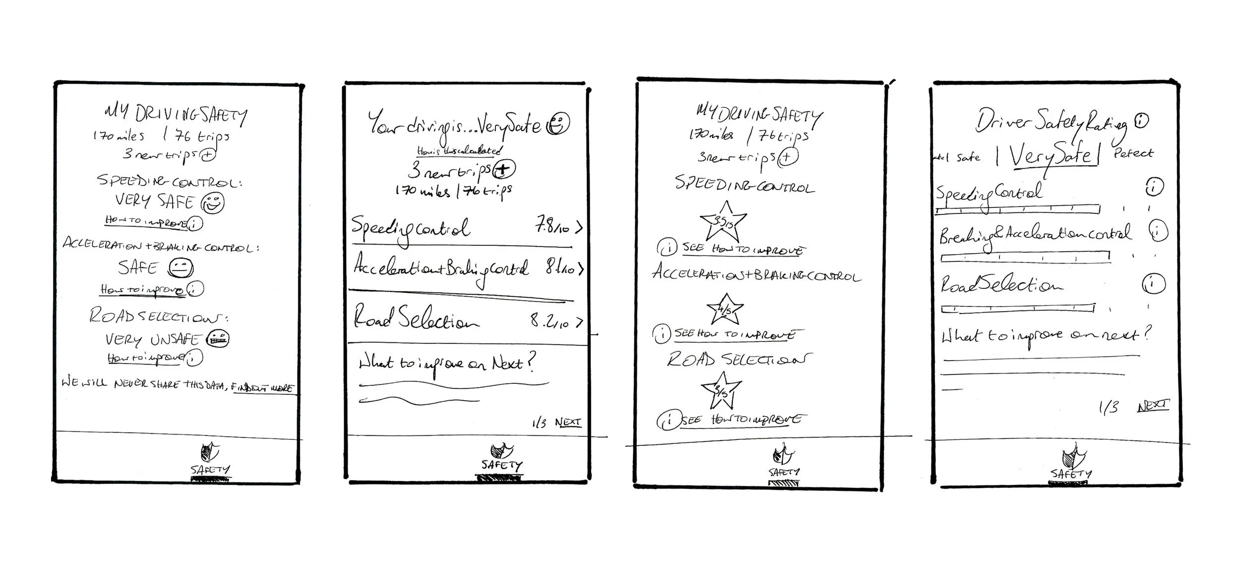
A prominent feature of the app was feedback of driving behaviour. It quickly became apparent from research that this feedback could be a sensitive issue for drivers. Taking this into consideration, the concepts we created attempted to lighten the tone of driving behaviour feedback, while also aiming to improve the user’s driving.
Emoji score gradient
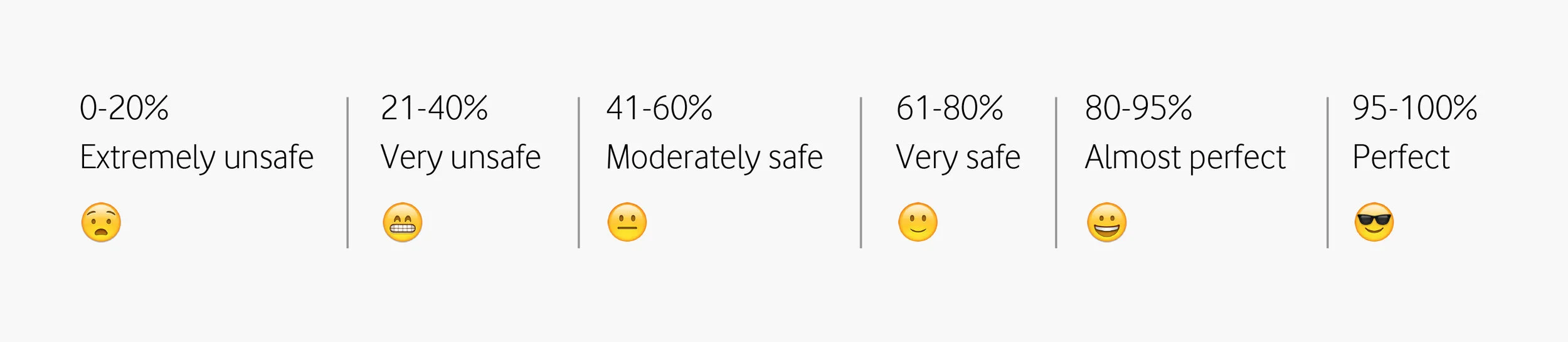
The hypothesis was that creating a range of emojis that would represent a driving score, could help the user understand an otherwise arbitrary driving score and give them an indication of how to improve their driving.
Concept development

User testing
Continuous exposure to user testing was a key part of launching beta businesses for Adaptive Lab. I designed the interview session, the stimulus, to test with users, conducted the interviews, transcribed, derived insights and presented back to the client to agree upon direction.

Driver safety score, selected design
Previously titled the ‘Drivescore’, renaming this feature to include the term ‘safety’ became key in users accepting criticisms for their driving behaviour. User engaged with the detail of the bar chart design, users also engaged with the emoji score concept.
Trips section prototypes
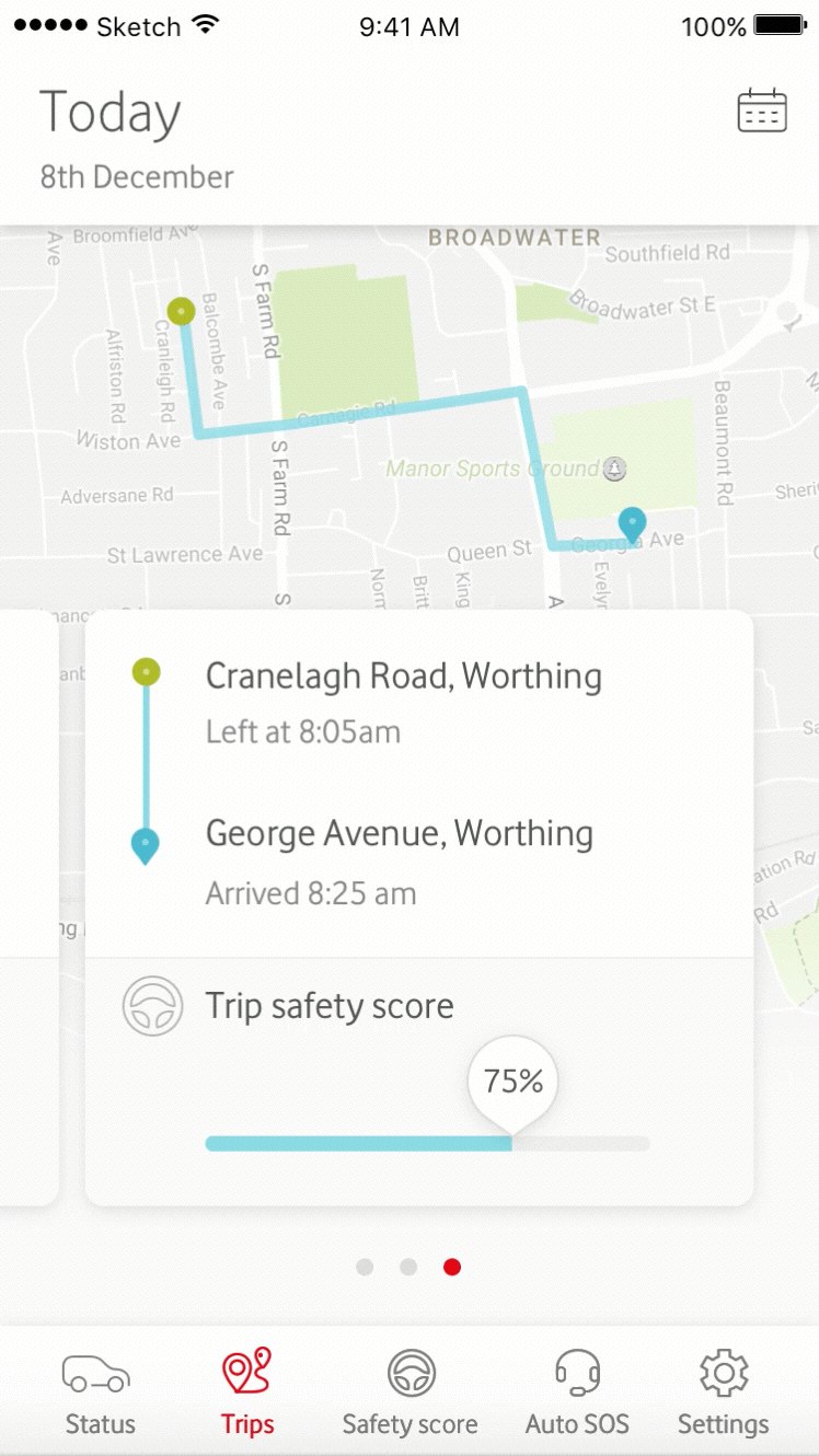
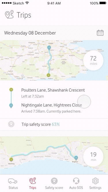
We created a series of trip history UI concepts to test with users. The users who were most engaged with this feature were interested in discussing with a family member who is learning to drive how they were doing. We wanted our design to facilitate this discussion, typically between parent and child. This led to the decision to surface the trip safety score at the top level.

Selected design for ‘Trips’
The selected design was based on historical feed, as this performed the best in user testing, with all participants easily discovering and preferring this option.
